Shore Thing Media - WIP
Brand Identity & Development
Company: Shore Thing Media
Project type: Brand Identity Package
Project Duration: 2 Week Design Sprint
SYNOPSIS
This project showcases the complete brand identity design for Shore Thing Media, a new digital marketing agency specializing in content creation, social media strategy, and marketing design. The goal was to craft a visual identity that balances creativity, professionalism, and a fresh coastal-inspired aesthetic that meet up with the New Jersey Origin.
The design process began with research and conceptual development, ensuring alignment with the brand’s vision and target audience. From there, multiple design iterations were explored to refine the core visual elements. The final brand identity package includes:
Logo Suite – Primary, secondary, and submark logos for versatile applications.
Color Palette – A refined selection of colors that evoke trust, energy, and creativity.
Typography System – A combination of typefaces for a cohesive and modern look.
Brand Patterns & Graphics – Custom design elements to enhance brand storytelling.
Social Media & Marketing Assets – Templates and guidelines for consistent branding across platforms.
Brand Guidelines – A comprehensive document outlining logo usage, color codes, typography rules, and overall brand voice.
This case study walks through each phase of the design process, from initial inspiration to the final polished brand identity, ensuring a strategic and cohesive visual presence for Shore Thing Media.
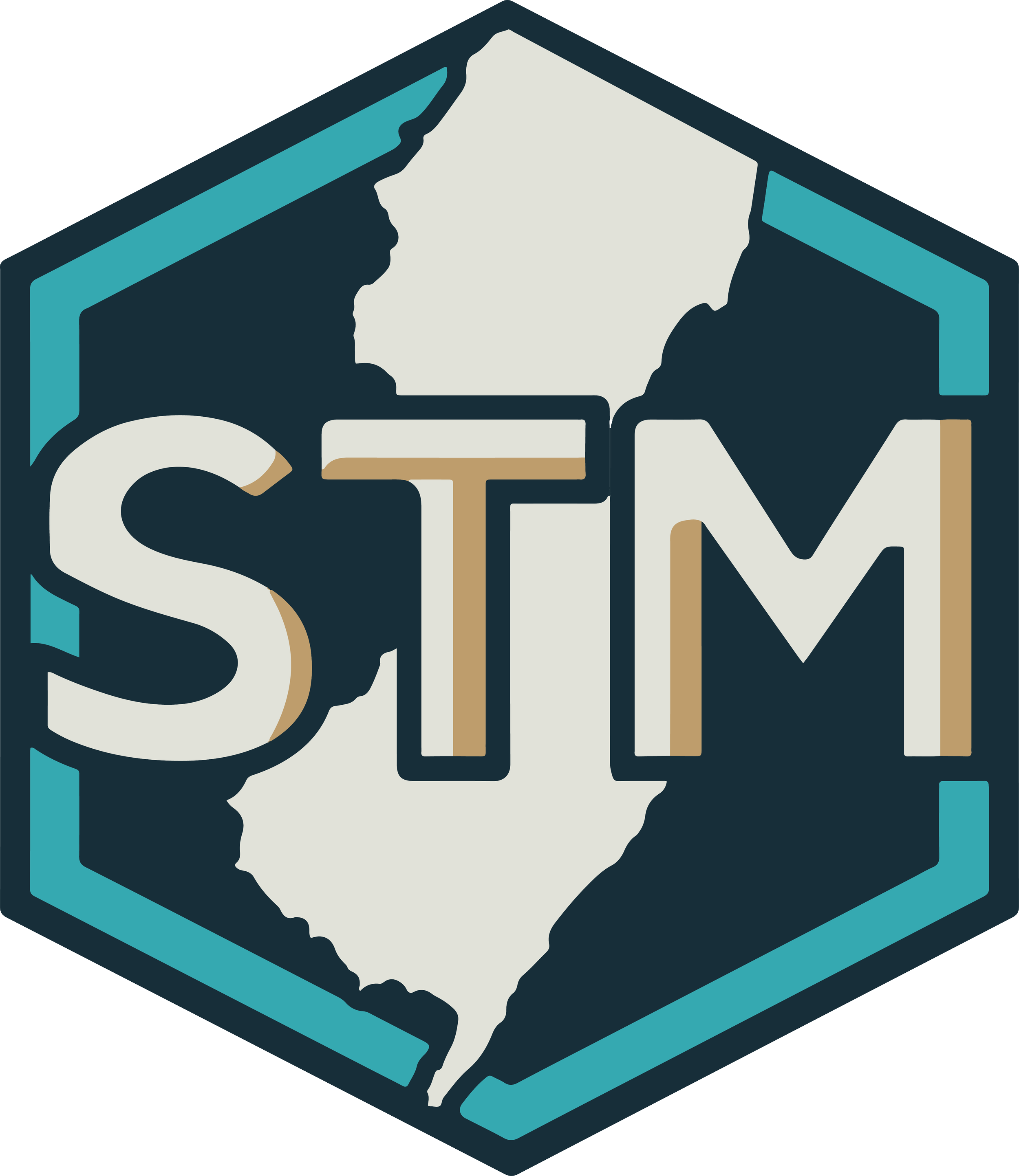
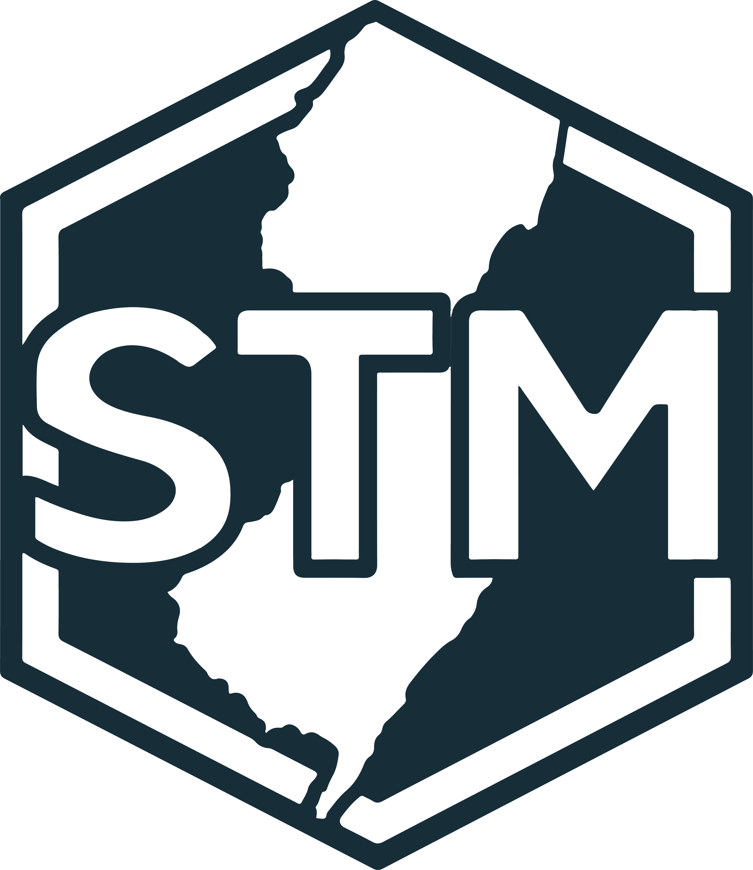
Logo Suite
Primary Logo
Badges/Logomark
Wordmark
Horizontal
LogoType


Color Palette
Alabaster
#E1E2D9
Soft and sun-bleached, like seashells resting on the shore at sunrise.
Lion
#BE9D6C
Warm and sandy, reminiscent of driftwood and dune grass swaying in the salty breeze.
Verdigris
#35A9B1
A weathered seafoam hue, like aged copper on a boardwalk railing kissed by the oceans mist.
Gunmetal
#172E39
Deep and moody, mirroring the horizon before a summer storm rolls in over the Atlantic.